Thursday, September 30, 2010

Gradient Borders with CSS


An example for Gradient Border to a box. This example works work in Mozilla and Firefox browsers.


Try with the below class property of the gradient border.

.gBorder {
border: 20px solid #000;
-moz-border-top-colors: #555 #666 #777 #888 #999 #aaa #bbb #ccc;
-moz-border-right-colors: #111 #222 #333 #444 #555 #666 #777 #888;
-moz-border-bottom-colors: #111 #222 #333 #444 #555 #666 #777 #888;
-moz-border-left-colors: #555 #666 #777 #888 #999 #aaa #bbb #ccc;
width:400px;
font-family:Verdana, Arial, Helvetica, sans-serif;
font-size:.9em;
padding:10px;
}

Tuesday, September 28, 2010

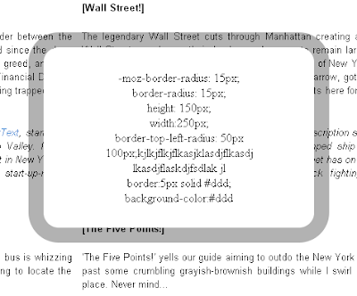
create rounded corners with CSS!


border-radius:

Good news for designers, now onwords no need to use rounded corner images to get rounded effect to the

boxes. The css3 border-radious property allows to easly utilise the rounded corners.

Basic Example

The following browsers support the rounded corners for Firefox, Safari/Chrome, Opera and IE9.
The css property for this example is, quite simple:

#bor1 {
border-radius: 15px;
}

To support Firefox browser, need to use the -moz- prefix

#bor1 {
-moz-border-radius: 15px;
border-radius: 15px;
}


<div
style=" -moz-border-radius: 15px;
border-radius: 15px;
height: 150px;
width:250px;
border-top-left-radius: 50px 100px;
border:5px solid #ddd;
background-color:#ddd" >
</div>


How border-radius Works

By using the four individual borders-radious properties

1. border-bottom-left-radius
2. border-bottom-right-radius
3. border-top-left-radius
4. border-top-right-radius


Rounded corners can be created independently.


<div
style="height: 65px;
width:160px;
-moz-border-radius-bottomright: 50px;
border-bottom-right-radius: 50px;
background-color:#ddd">
</div>


<div style="
height: 100px;
width:250px;
-moz-border-radius-bottomright: 50px 25px;
border-bottom-right-radius: 50px 25px;
background-color:#ddd >
</div>


<div
style="height: 130px;
width:250px;
-moz-border-radius-bottomright: 25px 50px;
border-bottom-right-radius: 25px 50px;
background-color:#ddd" >
</div>


<div style=" height: 100px;
width:250px;
-moz-border-radius: 1em 4em 1em 4em;
border-radius: 1em 4em 1em 4em;
background-color:#ddd" >
</div>


<div style="height: 130px;
width:250px;
-moz-border-radius: 25px 10px / 10px 25px;
border-radius: 25px 10px / 10px 25px;
background-color:#ddd" >
</div>


<div style=" height: 100px;
width:250px;
-moz-border-radius: 350px;
border-radius: 35px;
background-color:#ddd" >
</div>


Monday, September 27, 2010

CSS3 Shadow Effect


Shadow effects are specified based on specified order. The property dont increase the size of the box, though they can extend past its boundaries.


.shadow {
text-shadow: 5px 5px 5px #a1a1a1;
font-size:3em;
color:#000;
font-family:"Times New Roman", Times, serif
}


The above class specifies text shadow effect, it extends 5px to the right and 5px below the text, and the 5px blur.

Browser Support

IE8 - None
FF3.5+ - Yes
SA1.3+ - Yes
OP9.5+ - Yes

shadow value must specify a shadow offset and a blur radius and color.

Using two lenghth values the offset will specified.

* First value represents the horizontal distance to the right of the text in positive.
The negative value move the text to left side.

* Second value represents the vertical distance below the text (if it’s positive) or above the text (if it’s negative).

The blur radius is specified after the offset values; it’s a length value that represents the size of the blur effect. If no radius is specified, the shadow will not be blurred.

Color can be specified before or after the offset and blur radius values.

The Most Exciting Aspects of CSS3

CSS3 is the new CSS kid on the block currently being drafted up by W3C. Here I list some of the most important changes I think will have the most impact on the future of web development!

1) The box-shadow property

Top of my list and many others, is the box-shadow property. This property will allow the developer to add a drop shadow effect to an element. Simply by specifying a colour of your choice, the horizontal offset which defines how much to the left or right you want the shadow, the vertical offset which defines how far up or down you want the shadow, and a blur radius which defines how deep or sharp you want the shadow to be. The great thing about this effect is that as it is rendered by the browser and not pre-rendered in an image Therefore it can be used on elements which are animated using jquery - the shadow is animated to!

2) The Border-radius property

This property is fantastic as it allows you to finally give your elements rounded corners. Simply provide a numeric measurement to define how large you want the radius to be. Each corner of an element can be individually defined. The rounded corners should also be reflected in the drop shadow if one is specified.

3) Web Fonts with @font-face

This is not strictly a CSS3 implementation I will admit as @font-face was already part of CSS2. However the exciting part is that developers will be able to specify OpenType and TrueType fonts for use in their websites instead of being restricted to Embedded OpenTypes. To do this you would refer to a font of your choice hosted on the internet (you can search for great resources by googling 'font face fonts'). You can then use these fonts anywhere else in your CSS font-family styles. This finally opens the door and gives a breath of fresh air to the typography of the internet.

4) The text-shadow property

One of my favourite new options is the text-shadow property. This works much like the box-shadow property as you provide a colour, two offsets and a radius. Like a lot of effects I would recommend being very subtle with this to achieve maximum impact. Using this with web fonts lends a lot of power to CSS without the need for photoshop.

5) background colour gradients

Specifiying gradient background effects for elements is again, very beneficial. This is another area where photoshop can now be bypassed in a lot of situations and hence improving your website size. You can specify a left to right, right to left, top to bottom, bottom to top or radial gradients to fill the background of an element, from one colour to another. Again, being subtle with effects like this is key for maximum impact.

6) The opacity property

The ability to control the opacity of an element is probably one of the most anticipated and widely used effect used today, where possible. by providing a number between 0 and 1 or a percentage, you can control how 'translucent' you wish your element, and its children, to be. The effect being you can see the elements beneath it.

CSS3 is an exciting and welcome development in the web development community. Using the above effects which are widely supported across the most recent, popular browsers, you'll be working more efficiently and effectively!

The author of this article is a freelance web designer who provides professional Web Design in Kent.

Article Source: http://EzineArticles.com/?expert=Nick_Bright

Friday, September 24, 2010

CSS Background Properties


Using the css background properties we can define the background effects of an element.

CSS background properties

1. background-color
2. background-image
3. background-repeat
4. background-attachment
5. background-position

Background Color

This property specifies the color of the background of an element.

body {background-color:#1ec7ff;}

The body will fll with given background color #1ec7ff

Background Image

This property specifies an image of the background of an element.

By specify the background image the image will spread the entire element

Below it the background property

body {background-image:url(desing.jpg);}


I have taken a small image and applied to the background it spread entire body


Background Image - Repeat

1.Horizontally
2.Vertically

By default background-image property repeats an image both horizontally and vertically.
In some cases we have to repeat the image only horizontally or vertically in that case:

body
{
background-image:url('design.jpg');
background-repeat:repeat-x;
}


background-repeat:repeat-x property is for repeat the image in x direction

body
{
background-image:url('design.jpg');
background-repeat:repeat-y;
}


background-repeat:repeat-y property is for repeat the image in y direction


Background Image - no-repeat

When we say background-image:no-repeat, it shows the image only once

We can set the background position by specifing the background-position property

body
{
background-image:url('design.jpg');
background-repeat:no-repeat;
background-position:right top
}


Instead of writing separately we can use short hand property.

body {background:#ffffff url('desing.jpg') no-repeat right top"}

Wednesday, September 22, 2010

Using Blockquote


Definition and Usage

The <blockquote> tag defines a long quotation.

Browser adds space before and after the blackquote element, and also add margins.

Styling the blocquote element by adding css properties

blockquote { padding: 10px; background: #eee; }


When the blackquote is nested with multiple paragraphs, each paragraphs will not have breathing space. So we need to add some spacing after the blocks.

blockquote, p { margin-bottom: 30px; border-bottom:1px solid #fff }

I have used "border-bottom:1px solid #fff" property to the paragraph element for understanding clearly.

Monday, September 20, 2010

Transparent Borders with background-clip


The Opacity declaration sets how opaque an element is. An opacity value of 1 means the element is fully opaque; an opacity value of 0 means an element is not at all opaque, i.e. fully transparent.


Try with the below css code:

background-color: white;

-moz-background-clip: padding;
-webkit-background-clip: padding;
background-clip: padding-box;

border: 20px solid rgba(205,131,25,0.3);

-webkit-border-radius: 25px;
-moz-border-radius: 25px;
border-radius: 25px;

padding: 25px;

text-align: center;

position: absolute;
top: 50px;
left: 500px;

--------------

The background-clip property is used to determine whether the backgrounds extends into the border or not.

-moz-background-clip: padding; -> Firefox 3.6
-webkit-background-clip: padding; -> Safari 4? Chrome 6?
background-clip: padding-box; -> Firefox 4, Safari 5, Opera 10, IE 9

The RGBA declaration allows you to set opacity (via the Alpha channel) as part of the color value.
border: 20px solid rgba(205,131,25,0.3);

Browser support :

-webkit-border-radius: 25px;
-moz-border-radius: 25px;
border-radius: 25px;

padding: 25px;
text-align: center;
position: absolute;
top: 50px;
left: 500px;

Monday, September 6, 2010

Thursday, September 2, 2010

WebKit HTML5 Search Inputs

One of the new types of inputs in HTML5 is search

<input type=search name=s>
It does absolutely nothing in most browsers. It just behaves like a text input. This isn’t a problem. The spec doesn’t require it to do anything special. WebKit browsers do treat it a bit differently though, primarily with styling.


A search input in WebKit by default has an inset border, rounded corners, and strict typographic control.

The Styling Limitations
WebKit has big time restrictions on what you can change on a search input. I would guess the idea is consistency. In Safari particularly, search fields look just like the search box in the upper right of the browser. The following CSS will be ignored in WebKit “no matter what”, as in, you can’t even fight against it with !important rules.

input[type=search] {
padding: 30px; /* Overridden by padding: 1px; */
font-family: Georgia; /* Overridden by font: -webkit-small-control; */
border: 5px solid black; /* Overridden by border: 2px inset; */
background: red; /* Overridden by background-color: white; */
line-height: 3; /* Irrelevant, I guess */
}

In other words, be extremely cautious about using any of those CSS properties on a search input unless you are OK with the search input looking very different in other browsers.

Allowed styling
The following CSS works as expected. The last three, in my opinion, should probably locked in like the properties above as styling those properties almost always looks worse than if you didn’t.

input[type=search] {
color: red;
text-align: right;
cursor: pointer;
display: block;
width: 100%;
letter-spacing: 4px;
text-shadow: 0 0 2px black;
word-spacing: 20px;
}

Busted styling
Be careful not to use text-indent on search inputs. The results are quite weird an inconsistent. Here is one example.


Sometimes the text is below like this. Sometimes it’s not visible at all. It appears to be related to elements around it as well as how much indent it has (low values sometimes work fine).

Show Previous Searches

This isn’t documented anywhere that I know of nor is it in the spec, but you if you add a results parameter on the input, WebKit will apply a little magnifying glass with a dropdown arrow showing previous results.

<input type=search results=5 name=s>


The integer value you give the results attribute is how many recent searches will appear in this dropdown, if there are that many.

I really like the little magnifying glass. It drive home the searchyness of the field, but I’m calling the functionality itself rather janky. On a page reload recent searches clears, so that dropdown will almost always say “No recent searches”, unless you have implemented some kind of Ajax search (and even that I haven’t really tested).

Size Restrictions
There are only three different “sizes” that WebKit search inputs can be, and it is determined by the font-size you declare on them.

Resulting Size CSS font-size
Small <= 10px
Medium 11px – 15px
Large >= 16px


Small, Medium, and Large. That’s all you get!

This small, medium, and large business can be extremely frustrating, as even setting identical font values, at the minimum for a “bump”, you’ll see font size difference across browsers.


Identical font sizings not idential.

Notice the (x) on the right hand side of the search inputs on the WebKit side. That is an additional feature of these search inputs in WebKit. If the input has any value (not a placeholder, a real value) the (x) will be present which is a functional UI control for clearing the input.

Speaking of placeholder text, search inputs are a great candiate for that.

<input type=search results=5 placeholder=Search... name=s>

And in case light gray isn’t your cup of tea, you can style the placeholder text:

::-webkit-input-placeholder {
color: orangered;
}

Source : http://css-tricks.com/webkit-html5-search-inputs/