A simple drill down menu for web, ipad, iphone
Create a .html file and paste the below html code in the body location
HTML CODE
<body>
<div id=’box’>
<div id=”menu”>
<div class=”nav”>DRILL DOWN MENU</div>
</div>
<div id=”button” class=’test’>CLICK ME</div>
<br class=”cb” />
</div> </body>
In the .html file copy the total javascript code and place it in HEADER location.
JAVA SCRIPT CODE
<script src=”http://ajax.googleapis.com/ajax/libs/jquery/1.3/jquery.min.js” type=”text/javascript”></script>
<script type=”text/javascript”>
$(function(){
$(‘#menu’).hide();
$(‘#button’).click(function(){
$(‘#menu’).slideToggle();
}); });
$(document).keypress(function(e) {
if (e.which == 27) {
$(‘#menu’).slideUp();
}
});
$(document).click(function(event) {
if ( !$(event.target).hasClass(‘test’)) {
$(‘#menu’).slideUp();
}
});
</script>
Create an external .css file and link it with .html file with <link> tag
CSS CODE
Read More
Saturday, June 4, 2011
Wednesday, May 4, 2011
What’s new in Dreamweaver CS5.5
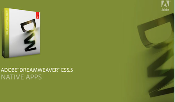
Some product releases are revolutionary, and some are evolutionary. It’s a bit more rare that they can be both. Whereas the Dreamweaver CS5.5 release may seem simply evolutionary given the “point-five” version number, the features contained within are highly focused to help you spark your own project-based multiscreen revolution, while only requiring a minor evolutionary shift in the Dreamweaver workflows and your own, finely-honed skills as a web pro. With HTML5 and CSS3 driving a new level of cross-device consistency—as well as adding significant new media and design capabilities independently—Dreamweaver CS 5.5 support for both will help you take your projects to a new level, regardless of whether you’re starting with an existing project that needs to become mobile application aware, or diving in on a mobile-specific site or application from scratch.
Rendering and preview
Although it won’t be apparent from reading the back of the box, Dreamweaver CS 5.5 Live View and Design View have both been updated to take advantage of the most current builds of Webkit, the rendering engine powering both the Safari and Chrome desktop browsers, as well as the lion’s share of mobile browsers to boot. This ensures that you get the most representative preview of your projects across desktop and mobile devices—and be able to visually author richer HTML5- and CSS3-based experiences with more confidence than ever before. But enough about the pretty pictures, let’s look at some of the features that will help you exercise Dreamweaver’s visual previews to their fullest extent.
Read More At : http://blog.varadesigns.com/?p=174
Monday, March 7, 2011
CSS Standards
Introduction
Cascading Style Sheets (CSS) are there to define the look and feel of one or several (x)HTML documents. By using CSS we separate content from presentation. Anything that is visual should be achieved via CSS (granted the targeted browsers permits that).
CSS should reside in its own document and should only be mixed with HTML when absolutely necessary. Furthermore, CSS should enhance the current markup and not replace it.
Applying CSS to documents.
CSS can be applied to one or several documents in different ways:
1. Linked in the document head via the LINK element
2. Linked in the document head via a STYLE element and the @import directive
3. Added directly to the head via the STYLE element
4. Inline in the HTML element via the STYLE attribute
More At : http://blog.varadesigns.com/?p=164
Friday, March 4, 2011
CSS Menu in 3D Look
Try with the below code
HTML
<div id="navcontainer">
<ul id="navlist">
<li id="active"><a href="#" id="current">Item one</a></li>
<li><a href="#">Item two</a></li>
<li><a href="#">Item three</a></li>
<li><a href="#">Item four</a></li>
<li><a href="#">Item five</a></li>
</ul>
</div>
CSS
More at : http://blog.varadesigns.com/?p=152
Thursday, March 3, 2011
Bokeh with CSS3 Gradients
Ever since Lea Verou mentioned about the possibilities of CSS3 Gradients, I have been using them in various shapes and sizes as a replacement for background images. I recently worked on a project which uses a bunch of circles as a decorative background. gf3 suggested that the circles would look much better like bokeh. Today, I finally got down to creating them.
DESIGN OF THE BOKEH
I referred to some pictures of bokeh, and these were their defining characteristics:
1. There should be groups of circles with same color (each circle outlined with the more opaque version of the fill). In each group, circles are close to each other.
2. The color transition from one color group to the other can be accomplished with a very blurry second color group radial gradient overlaid on the first group.
Read More At : http://blog.varadesigns.com/?p=143
Tuesday, March 1, 2011
Create a Tasty Website Design With Different Flavor of Colors
In current trend, online presences become very essential for commercial business, for example online e-commerce product store, online gift store, greeting cards websites, clothing website and lot of other vertical websites. According to individuals and businesses the flavors will be different. While creating a website few things need to be taken care like, Nature of business, Age group who going to visit the website, Product or Service type, Pricing of product or services. No one can succeed in business with common website design on the internet. Before a decade, awareness of website design is very less in a general public, but now a day due to the distance and lake of timing, suddenly use of website increased a lot. While creating a website web design company or designer is very important, first always ask for their work portfolio, so you can get the idea of their work and capability.
Read More At :http://blog.varadesigns.com/?p=128
Read More At :http://blog.varadesigns.com/?p=128
Friday, February 25, 2011
Fade Image Into Another (within a Sprite)
Creating an image rollover is pretty easy with CSS. Give the element a background-image, then on it's :hover, change the background-image. It's best practice to combine both images into one and shift the background-position rather than use two separate images, that's the idea of CSS sprites. But what if you want to fade one image into another, not just have an abrupt shift?
The solution there is to create an additional element on top of the original with zero opacity and the background-position already shifted into place. Then on the :hover, fade in the opacity. Here are three ways to do that, using a little arrow graphic.
Read More : http://css-tricks.com/fade-image-within-sprite/
Checkerboard, striped & other background patterns with CSS3 gradients

You’re probably familiar with CSS3 gradients by now, including the closer to the standard Mozilla syntax and the ugly verbose Webkit one. I assume you know how to add multiple color stops, make your gradients angled or create radial gradients. What you might not be aware of, is that CSS3 gradients can be used to create many kinds of commonly needed patterns, including checkered patterns, stripes and more
Article Source: http://leaverou.me/2010/12/checkered-stripes-other-background-patterns-with-css3-gradients/
Sunday, February 13, 2011
The Power of CSS’s Automatic Numbering
CSS is great for styling your website, but did you know it can do math? Of course it can! When you define an ordered list who do you think keeps track of the numbers? It’s built into CSS!
<ol>
<li>Opening Scene</li>
<li>Boy Meets Girl</li>
<li>Boy Looses Girl</li>
<li>Boy Fights Opponents
<ol>
<li>The Wrestler</li>
<li>The Engineer</li>
<li>Captain Doom</li>
</ol>
</li>
<li>Everybody Lives Happily Ever After</li>
</ol
Article Source: http://kitmacallister.com/2011/02/11/css-automatic-numbering/
<ol>
<li>Opening Scene</li>
<li>Boy Meets Girl</li>
<li>Boy Looses Girl</li>
<li>Boy Fights Opponents
<ol>
<li>The Wrestler</li>
<li>The Engineer</li>
<li>Captain Doom</li>
</ol>
</li>
<li>Everybody Lives Happily Ever After</li>
</ol
Article Source: http://kitmacallister.com/2011/02/11/css-automatic-numbering/
Wednesday, February 9, 2011
The Shapes of CSS
Rendering shapes with CSS
Try with the below css properties to get the OVEL shape
CSS Code
<style type="text/css">
#ovalShape {
width:200px;
height:100px;
background:#0f0;
-moz-border-radius:100px / 50px;
-webkit-border-radious:100xp / 50px;
border-radius:100px / 50px
}
</style>
HTML Code
<div id="ovalShape" ></div>
Try with the below css properties to get the OVEL shape
CSS Code
<style type="text/css">
#ovalShape {
width:200px;
height:100px;
background:#0f0;
-moz-border-radius:100px / 50px;
-webkit-border-radious:100xp / 50px;
border-radius:100px / 50px
}
</style>
HTML Code
<div id="ovalShape" ></div>
Monday, January 24, 2011
HTML5 Page Structure
<!DOCTYPE HTML>
<html>
<head>
<meta http-equiv="Content-Type" content="text/html; charset=UTF-8" />
<title>Website Name</title>
</head>
<body>
<header>
<nav>
<ul>
<li>Menu - Main Navigation</li>
</ul>
</nav>
</header>
<section>
<article>
<header>
<h2>Title</h2>
<p>Posted on <time datetime="2009-09-04T16:31:24+02:00">January 25th 2011</time> by <a href="#">Writer</a> - <a href="#comments">6 comments</a></p>
</header>
<p>"Ye are the angels, if your feet be firm, your spirits rejoiced, your secret thoughts pure, your eyes consoled, your ears opened, your breasts dilated with joy, and your souls gladdened..."</p>
</article>
<article>
<header>
<h2>Article title</h2>
<p>Posted on <time datetime="2009-09-04T16:31:24+02:00">September 4th 2009</time> by <a href="#">Writer</a> - <a href="#comments">6 comments</a></p>
</header>
<p>My thinking about angels is something new for me, fresh and pure. By daring to openly acknowledge their existence</p>
</article>
</section>
<aside>
<h2>About section</h2>
<p>We all know the word, but how many of us give much credence to the idea, have faith in the existence of angels? And, if we do, would we admit it to ourselves let alone to somebody else. I mean, for me for instance: I am a man, some would say a manly sort of man. I even have a friend who says I'm a pirate, or at least that I laugh like one. </p>
</aside>
<footer>
<p>Copyright 2011 Website name</p>
</footer>
</body>
</html
Sunday, January 23, 2011
CSS background image hacks
Emulating background image crop, background image opacity, background transforms, and improved background positioning. A few hacks relying on CSS pseudo-elements to emulate features unavailable or not yet widely supported by modern browsers.
Demos: Example CSS background image hacks
Pseudo-element hacks can fill some gaps in existing browser support for CSS features, without resorting to presentational HTML. In some cases, they even make it possible to emulate things that are not currently part of any W3C working draft, like background transforms and background image opacity.
Most of the hacks in this article tie in with the pseudo-element hack described in an earlier article – Multiple Backgrounds and Borders with CSS 2.1. That article already describes how to emulate multiple background support and its demo page shows several other uses of the basic principle. This article presents a few of those effects and applications in greater detail.
Read More : http://nicolasgallagher.com/
Subscribe to:
Posts
(
Atom
)