I’ll start by showing you the entire stylesheet, then I’ll explain a little bit about what I was thinking.
body {
font-family: Georgia, serif;
background: none;
color: black;
}
#page {
width: 100%;
margin: 0; padding: 0;
background: none;
}
#header, #menu-bar, #sidebar, h2#postcomment, form#commentform, #footer {
display: none;
}
.entry a:after {
content: " [" attr(href) "] ";
}
#printed-article {
border: 1px solid #666;
padding: 10px;
}
1. Make the type as readable as possible
On the web, the body type for articles here is a sans-serif. On the printed page, I think that serif fonts are easier to read so I reset the font-family to Georgia. No background and black text is the default, but just in case, I explicitly declare it in the body.
2. Use as much of the page as possible
Again, I think this is default behavior, but since I wrap my content in a “page” tag anyway I thought I would make use of that to set a 100% width and remove any margin and padding.
3. Default styling ain’t bad for print
Notice that I didn’t do typographic styling whatsoever except setting the font. Default print styling does, what I feel, is a pretty decent job here on it’s own. This is assuming that you are using quality markup. In my articles, the title is an <h2> tag, the sub-titles are <h3> tags, and the body paragraphs are in <p> tags. This results in a nice hierarchy of font sizes on the printed page without any styling necessary.
Code samples, which are wrapped in <code> and <pre> tags default to a monospace font, which is great. Unordered lists get a healthy indent and are bulleted.
3. Remove the extra stuff
Chances are, if someone is printing an article of yours it is because they want to save the content as reference material, read it later, or share it with a friend. They really don’t need to see your page navigation, sidebar, or fancy footer. Again assuming that you have nice and semantically marked up code, removing those sections should be as easy as setting the display value of the parent elements of those areas to none.
4. Display the URLs in the body content
[Thanks to David Walsh for this idea] Links in your content don’t do any good on the printed page. It would be pretty cool if you could just tap the linked word with your finger and it would open the webpage on your computer, but thats something I haven’t even seen in the movies yet. For now, we can just use CSS pseudo class “:after” to drop in the URL right next to the link, using the content attribute. IE doesn’t support it, but c’est la vie.
5. Include a thank-you note
At the end of my content, I put a little “thank you” note. This area gets hidden on the web, but is displayed when printing the article. I think it’s just a nice touch and also serves as a reminder they should come back to the website for fresh stuff.
6. Optional: Page breaks
I didn’t feel my articles really warranted specific page breaks, but if you write really long articles with sub headers, you should definitely consider placing page breaks before each of those sub headers. Another place that would be good to use a page break is right before a fairly large table. Nothing is worse than having to flip between pages looking at a table because it happened to fall overlapping two pages when it could have fit onto one. I plan to use these on a case-by-case basis. More on page breaks here.
Source : http://css-tricks.com/css-tricks-finally-gets-a-print-stylesheet/
Saturday, September 14, 2013
Sunday, September 8, 2013
At @ Rule CSS
The default way to include an external stylesheet is to use the the link tag inside your pages head:
<link rel="stylesheet" type="text/css" href="default.css" />
That is a tried and true method and supports the whole spectrum of browsers from old and ancient to hip and modern. But let’s say you grow tried of the old and ancient… You don’t want your page to be completely unusable, but you would rather it look completely non-styled than broken and clumsy. You could use an @ rule to declare your CSS instead like this:
<style type="text/css" media="all">@import url(default.css);</style>
This leaves outdated browsers like Netscape 4.x out of the mix and will deliver to them a style-less page. Assuming your markup is good, you should be fine.
At-Rules are good for other fanciness, but none of it as globally effective as this. Internet Explorer (IE) supports the embedding of external font faces with @ rules, which is something every designer should drool over, but IE is the only one on the bandwagon which makes it mostly pointless and implementing it would be a step in the wrong direction. A better way to embed font’s (on a small scale) is to use sIFR, which we will cover if we can find some way to relate it to CSS =)
Wednesday, July 31, 2013
Why Your Small Business Website Should Have a Blog?
Many small business owners think that promoting and branding
their business will cost them huge amount. They generally are weak in
finances and look for cheaper alternatives that can make a huge impact.
Maintaining a good website with a decent blog is one such alternative
that helps small business promote their businesses cost-effectively.
Having a blog in your small business website is very important. It has multiple advantages - it helps you gain your readers' trust, drives more traffic and expands your brand. A blog adds value to your Internet marketing strategy, and it enhances the interaction and engagement with customers. Let us discuss why you should consider having a blog in your website.
A blog is an inexpensive means of communicating with your customers
Blogging is an inexpensive way to brand and promote your business and a great way to communicate and connect with your potential customers. Through the blog, you can send messages to customers, reply to the comments and address their concerns instantly.
It is an inexpensive tool for communicating with customers and a low cost method to get your company's name out in the World Wide Web and reach a larger set of targeted audience. Literally, maintaining a blog (creating content, publishing and responding to comments) for the full month costs lesser than 1/10 of a 10-second TV ad during prime time.
Better relationship with customers
Publishing educational and informational content relevant to your service/product helps businesses better engage with their customers, drive sales and build customer loyalty.
A blog enables you to interact with your customers regularly. Interaction with customers gives good insights. As you keep posting good content, over time customers are likely to develop trust and you will earn their goodwill. Your blog is likely to become an important source of information for customers. It improves your relationship with your customers.
Customers can express their concern as and when they need
The blog in your website helps customers express their view point on your product/service. They may express their genuine concerns on the blog any time. They can simply write their view point and post it immediately.
Watch out for such comments. Be proactive while replying to the legitimate concerns and posting content. This is likely to make customers loyal to your business. Such loyal customers are likely to yield conversions. It helps in measuring user experience and keeping a track of what users are saying about the business.
Blog helps in better search engine rankings
Blogging regularly helps in improving search engine rankings. Search engines have a positive impression on blogs that are active, accurate and provide authoritative and original content. Search engines look for fresh content and give prominence to websites with such content. Your blog is the best way to provide fresh content. Small business owners need to remember that, to get the most out of their blog, they need to monitor and update their blog regularly.
Better late than never, small business owners should realize the importance of a blog in their website and maintain it properly to attract more traffic and sales to their business. So, in order to be successful, keep blogging regularly.
Tuesday, July 30, 2013
Free download: CSS3 buttons
Button states saved as images and toggled by
CSS are so out of date it’s painful. We should all be using CSS3 to
create buttons. We all know why: they’re easily editable,
cross-platform, lightweight, accessible; the list of benefits is
endless.
What’s not always so easy is coding them up. Sure you can use a
framework, but for most projects that’s just too big of an overhead.
Maybe you want to stick to flat design; just add a background color and
make sure the default border is removed. Anyone else will be delighted
that Irina Petculescu, a self proclaimed CSS3 junky and founder of prowebdesign.ro has put together these free CSS3 buttons. See her site for more freebies.They come in two styles: flat, which maintains a small bevel; and glossy, with nicely rendered gradients. There’s even some basic transitions to make the rollovers nice and smooth.
What’s even better is that the team made sure they used rgba formatting for the styling, leaving the background colors in hex format. That means you’re free to change any of the hex colors you see in the CSS and the button background color will change instantly.
The buttons are free for personal and commercial use, so download them now and start tweaking them for your brand.

Article : http://www.webdesignerdepot.com/2013/07/free-download-css3-buttons/
Sunday, July 28, 2013
E-Commerce Web Design Essentials
The number of e-commerce websites currently in operation is said to be in the millions. This means there's huge potential for businesses to reap rich profits by taking their marketing online. If you're a web designer, you know just how lucrative website development is.
This huge number should be cause for motivation. Competing against well-known companies and their online stores is not easy but wholly possible by focusing on the target market and presenting products and services in an easy-to-understand manner. Inspiration can be sought from any one of the top websites out there but make sure you don't forget to follow these important tips.
Layout
There's no standard layout as this depends on the client, the designer and what the business is trying to sell. For example, a clothing retail store follows fashion's footsteps so it can't be devoid of trendy elements. Similarly, an electronics store is part of technology and the use of clean lines and futuristic accents complement what's being sold.
Search bar
In a store selling thousands or millions of products, customers don't have the patience going through everything. A visible and properly functional search bar makes it easy to filter items even with the inclusion of filters.
Filter
Filters like 'Men', 'Women' in a clothing or footwear store are standard. Under them, more options like 'size', 'color', 'tops/shirts', 'skirts/pants', 'stilettos/loafers' etc must be included. First-time shoppers are taking a risk by shopping online and they'll want to make sure products fit. Filters make the experience easier and give them confidence.
Images
The use of medium to large images is recommended because tiny photos don't show details clearly. High resolution images optimized for fast loading and expansion are close as customers get to touching them. The use of editing software to clean up photos is, of course, necessary but not so much so that products look artificial.
Images for a product should have different views, front, back, side, underside (for shoes, toys, electronics etc). A 360-degree view should be used for complex products with many parts.
Breadcrumb navigation
Breadcrumb navigation gives a user a clear view (through links) of the pages he's visited in a website. An example is Home-Men's footwear-Lifestyle-. This system enables him to go back to any one of the three links instead of pressing 'back' several times on the browser.
Emphasis on clean design
http://ezinearticles.com/?E-Commerce-Web-Design-Essentials&id=7887661
Friday, July 26, 2013
Create Responsive Website With 10 Varied Resources
The sagacious website designing is the source of attracting visitors and elucidating them about the strength of business. The website should have the ability to attract visitors and also emphasize on the different aspects of your business. If the web designing is interesting then the viewers will visit the site again and again that improves the chance of increasing the sales of your business. Hence, it is important for the business owners to use the best resources for the development and designing of the website.
Resources to Develop a Better Websites
Here, you will find 10 exclusive and attractive resources to design a website that reaches the expectations of savvy world.
Columnal
This elastic grid system is made up of cssgrid.net and the idea of sub-columns is driven from 960.gs. It is basically a blend of some custom codes.
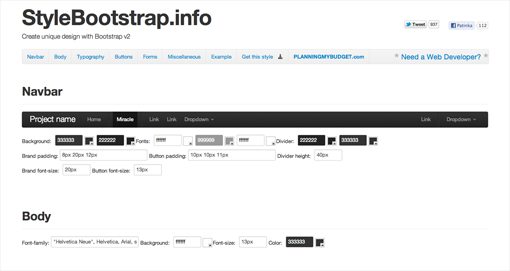
Bootstrap v.2.0 from Twitter
Bootstraps stylesheet offer help in easy implementation of 960grid for efficient layout and allows developers to avail crafted styles for typography, navigation tables, forms buttons and more. By using Bootstrap, it's very easy to carry JavaScript touches as it provides a set of jQuery plugins for menus, tabs, tooltip, alert messages, drop-down list and more.
Normaliz.css
By deploying normalize.css file, developers can enjoy a great cross-browser consistency with a default styling of HTML elements. It targets all the HTML styles that need normalizing. All the elements are rendered with modern standards in varied browsers.
Mobile Boilerplate
Website development can turn into an enchanting experience when worked with the new resources such as Mobile Boilerplate. It helps in building fast, robust and adaptable web apps or sites.
Button CSS3 UI
Button CSS UI is easy to integrate and thus used in many websites and blogs these days. It adds numerous functionalities to the website and enhances the design to attract visitors.
CSS3 Patterns Gallery
It offers a large collection of CSS3 patterns and that's why called as the gallery of CSS3 files. The front page will give you many options of varied patterns, and with a single click you will be able to fetch codes to create the patterns.
Modernizr
Quite frequently, you can see web development agency using Modernizr in the development process of websites. It is a JavaScript library that observes HTML5 and CSS3 features in the browser and runs at high level on page load to find the features. At the end, it creates a JavaScript object with results and adds classes to the HTML element to work on CSS file. It also supports varied tests and sometimes includes YepNope.js to load external.js and.css resources depending on the needs.
Initializr
Start your project with magnificent Initializr to develop a new website. It creates templates that are based on HTML5 Boilerplate and allows you to choose between the different parts to be deployed. It gives basic design with responsive template instead of a blank page in the starting of the website.
Sencha CSS3 Animator & HTML5 Animations
New rich media ads are now created on Sencha Animator that uses CSS3 animations to give a modern and new generation look. You can easily captivate your audience and engage them for long time by providing animated text and images with smooth transitions, design buttons with gradients and embed analytics.
http://ezinearticles.com/?Create-Responsive-Website-With-10-Varied-Resources&id=7887088
Sunday, July 21, 2013
Making Website Using Bootstrap
Bootstrap is an open source set of files written in CSS (or Cascading Style Sheets, a programming language used to dictate how a website or web app looks and works) that covers some of the building blocks of most web apps, such as buttons, tables and forms, page templates, app navigation and even stylistic matters such as typography and color gradients.
Downloading Bootstrap
The simple and small tools released by Twitter, The file size would be around 300-500 KB so it doesn’t matter anyway. Extract the bootstrap in a directory named bootstrap and place it inside the folder of the theme for which you wish to add the bootstrap.

Your Bootstrap folder will contain 3 folders named css, js, and img and just as the name suggests they contain CSS files, JavaScript files, and some related images. If you have downloaded the customized version of bootstrap from the link given above then you will have 2 files in the CSS folder named bootstrap.css and bootstrap.min.css but if you have downloaded from another source, make sure that the CSS folder contains bootstrap-responsive.css file as it would be necessary to create a responsive website.
Once downloaded, unzip the compressed folder to see the structure of (the compiled) Bootstrap. You'll see something like this:

Monday, July 15, 2013
CSS Gradient Text Effect
Do you want to create fancy headings without rendering each heading with
Photoshop? Here is a simple CSS trick to show you how to create
gradient text effect with a PNG image (pure CSS, no Javascript or
Flash). All you need is an empty
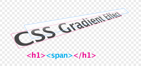
More Detailed at : http://webdesignerwall.com/tutorials/css-gradient-text-effect
position:absolute
property. This trick has been tested on most browsers: Firefox, Safari,
Opera, and even Internet Explorer 6. Continue to read this article to
find out how.Benefits
- This is pure CSS trick, no Javascript or Flash. It works on most browsers including IE6 (PNG hack required).
- It is perfect for designing headings. You don't have to render each heading with Photoshop. This will save you time and bandwidth.
- You can use on any web fonts and the font size remains scalable.
How does this work?
The trick is very simple. Basically we are just adding a 1px gradient PNG (with alpha transparency) over the text.More Detailed at : http://webdesignerwall.com/tutorials/css-gradient-text-effect
Sunday, July 14, 2013
50 Awesome Animations made with CSS3
CSS3 has brought some amazing new features. And the most fun is playing with the CSS animation. Here is a compilation of 50 CSS3 animation
that allows you to perform many motion-based functions normally
Delegated to JavaScript. In order to view this effect, you are required
to have WebKit browsers like Safari and Chrome ( very sorry for the
users of Internet Explorer )
1. CSS3 Clock With jQuery
Use the basic features of the CSS3 Transform: rotate. And the combination of javascript frameworks like jQuery can produce a cool CSS3 clock

2. Analogue Clock
1. CSS3 Clock With jQuery
Use the basic features of the CSS3 Transform: rotate. And the combination of javascript frameworks like jQuery can produce a cool CSS3 clock
2. Analogue Clock
Analogue clock created using webkit transition and transform CSS. JavaScript is only used to pull in the current time.

Source : MORE
Source : MORE
Monday, July 8, 2013
Custom theme on JQUERY THEME ROLLER
Building your custom theme with the JQUERY THEME ROLLER is very easy and fast. This tool is a state of the art style builder used by thousand of websites. You’ll need to have access to your website to upload the files.
It is recomended that you pick one existing theme and edit it instead of creating one from scratch. Navigate to JQuery Theme Roller, click the gallery tab, choose one of the theme to use it as a starting point, and then click the “Roll your own” tab.
jQuery UI is a curated set of user interface interactions, effects, widgets, and themes built on top of the jQuery JavaScript Library. Whether you’re building highly interactive web applications or you just need to add a date picker to a form control, jQuery UI is the perfect choice.
Friday, July 5, 2013
Resources for Twitter Bootstrap
Bootstrap
Sleek, intuitive, and powerful front-end framework for faster and easier web development.
Sleek, intuitive, and powerful front-end framework for faster and easier web development.
As with Twitter’s own tool above, this tool allows you to use a simple interface to customize various aspects of Bootstrap. The difference here is that this one focuses primarily on the visual, design aspects. You can easily go in and change colors, fonts, borders, and a lot more.

A wonderful collection of different themes, you can access and download all the themes in the collection. Really stunning design work.
This is a completely vector based UI toolkit built to mirror Twitter Bootstrap. This is great if you’re not a coder or just need to have a place to shuffle the pieces around without bothering with CSS.
HTML5 responsive frameworks
HTML5 Boilerplate
HTML5 Boilerplate helps you build fast, robust, and adaptable web apps or sites. Kick-start your project with the combined knowledge
HTML5 Boilerplate helps you build fast, robust, and adaptable web apps or sites. Kick-start your project with the combined knowledge
Once you have cloned or downloaded HTML5 Boilerplate, creating a site or app usually involves the following:
1. Set up the basic structure of the site.
2. Add some content, style, and functionality.
3. Run your site locally to see how it looks.
(Optionally run a build script to automate the optimization of your site – e.g. ant build script or node build script).
4. Deploy your site.
1. Set up the basic structure of the site.
2. Add some content, style, and functionality.
3. Run your site locally to see how it looks.
(Optionally run a build script to automate the optimization of your site – e.g. ant build script or node build script).
4. Deploy your site.
It is a collection of CSS and HTML conventions. It uses some of the latest browser techniques to provide you with stylish typography, forms, buttons, tables, grids, navigation and everything else you need in a super tiny (only 6k with gzip) resource
Zurb Foundation
Foundation is the most advanced responsive front-end framework in the world. With Foundation you can quickly prototype and build sites or apps that work on any kind of device, with tons of included layout constructs (like a full responsive grid),
Foundation is the most advanced responsive front-end framework in the world. With Foundation you can quickly prototype and build sites or apps that work on any kind of device, with tons of included layout constructs (like a full responsive grid),
Skeleton
Skeleton is a small collection of CSS files that can help you rapidly develop sites that look beautiful at any size, be it a 17″ laptop screen or an iPhone. Skeleton is built on three core principles:
Skeleton is a small collection of CSS files that can help you rapidly develop sites that look beautiful at any size, be it a 17″ laptop screen or an iPhone. Skeleton is built on three core principles:
HTML KickStart
HTML KickStart is an ultra–lean set of HTML5, CSS, and jQuery (javascript) files, layouts, and elements designed to give you a headstart and save you 10′s of hours on your next web project.
HTML KickStart is an ultra–lean set of HTML5, CSS, and jQuery (javascript) files, layouts, and elements designed to give you a headstart and save you 10′s of hours on your next web project.
Wednesday, July 3, 2013
Top 5 Reasons to Create a Unique Website
Gone are the days when procuring new business deals depended merely upon the traditional forms of advertising, such as newspapers, TV or radio. Today, unless you are innovative and proactive in your thinking as well as actions, you may easily fall way behind your competitors.
Well, if you believe that you can succeed in getting good returns by just creating a plain-looking website, think again. Or rather, think on the following lines-take a look at the multifarious benefits waiting in store for you if you spend some time and energy in adding value and uniqueness to your website:
i. Create more scope for visibility
Since there are thousands of websites already existing in your chosen field of business, it is quite natural for visitors to look for something unique and eye-catching in your site. They don't want to go to a site that is boring or too jazzy. On the other hand, if you are able to add value and uniqueness to your website by adding fresh and informative content, appropriate videos, suitable sitemaps, and so on, visitors will be easily impressed and would like to come back to your site again soon.
ii. Effective tool for diverting traffic to your website
Once the visibility of your website increases, consequently, the volume of traffic it receives also goes up. This is a welcome sign for your site and business too. With potential customers visiting your site more often than before, you stand a good chance to start receiving more calls or emails about your products or services. You should aim at converting these calls into actual business deals.
iii. Good chance to edge your competitors
With an attractive, fresh and informative website to support your business, you gain better chances of winning over your competitors and improving your ROIs.
iv. Create a distinct market niche
An increase in the number of successful business deals in turn paves the way for your business gaining a larger market share. In turn, your brand image is enhanced and satisfied customers begin to refer your products/services to their contacts. Such referrals also add to the expansion of your business. In a nutshell, your surge way ahead of your competitors by creating a unique market niche.
v. Start ranking higher in search engines
http://ezinearticles.com/?Top-5-Reasons-to-Create-a-Unique-Website&id=7828680
Tuesday, July 2, 2013
Responsive Website Design: What Is It? Why Is It Important for a Business Website
In today's world, the internet is a vital tool especially for small businesses and for interacting. It is agreeable that the internet impacts our lives in many ways. Before, a user can only access the internet through a computer (with internet access) at home or office. Then, laptops became available, thus, giving us the ability to have internet access - almost - everywhere we go. And now, we have mobile phones that are web enabled (internet in our pockets or at the palm of our hands). In fact, eighty-five percent of mobile phones sold in 2011 were web enabled and twenty-five percent of web users are mobile only. In one hand, it is a cool thing to browse the internet on your mobile phone. On the other hand, there are drawbacks.
One drawback with internet access on a mobile phone is the screen size. The screen sizes on mobile phones are smaller than those of a computer or laptop, which makes it hard to browse most web pages. Sometimes, you would have to zoom in or zoom out, or buy a new mobile phone with a slightly bigger screen size. For this reason, a solution has been found and this solution is "a responsive website."
Lately, there has been a lot of buzz about the new responsive website(s). What is it?
Responsive Websites Benefits
A responsive website changes its appearances and layout based on the size of the screen the website is displayed on. Also, a responsive website can be designed to make the text on the page larger and easier to read on smaller screens (no more straining your eyes). In addition, this future of web designs empowers you (or web designers) to make changes to the sites content without a lot of knowledge of HTML. That way, there would be no need to develop a second website exclusively for mobile use.
Moreover, users who browse the internet on their mobile phones as a hobby or for business is now able to benefit from a responsive website. Some of the benefits are:
- It keeps your website continuous
- It is cost effective
- It's a time saver
http://ezinearticles.com/?Responsive-Website-Design:-What-Is-It?-Why-Is-It-Important-for-a-Business-Website&id=7827165
Friday, June 28, 2013
The Role of PSD to HTML Conversion for Enhanced Site Visibility
The internet is a vast ocean of information and most businesses today have a strong online presence for better visibility. There are different types of technologies for building an innovative website. PSD to HTML conversion is frequently opted for by business houses to turn their websites into a robust and visually attractive one.
There are different technologies available for fulfilling various requirements. PSD is a file format offered by Adobe Photoshop. PSD to HTML conversion services enables to have a better visibility and a wider reach for businesses. PSD files are essential to make the website visually attractive, but the web pages do not accept these file format. So, businesses are looking for attractive PSD to HTML conversion services that will prove profitable to their business.
Some of the important benefits of PSD to HTML conversion are as follows:
- PSD files are quite heavy to load and also not very browser- friendly. While converting such a file to HTML enables to make the file light- weight and browser- friendly. This is important as part of web development.
- HTML involves correct and strict coding, which plays an important role in enhancing the quality of the overall website. A company's website represents the business and attracts customers towards it. It is important for the web development work to be flawless and user- friendly. This enables to attract more visitors to the site and gain potential customers.
- Search engine optimization is a great tool to market a business. It refers to the process of working on the techniques to see that the website ranks in the first pages of all the major search engines like Google and Yahoo. PSD to HTML converted files are easy to optimize for the search engines.
- This sort of a conversion also enables to speed up the loading time, which is an important consideration for retaining the web visitors. If a particular web page takes lot of time to open up, chances are that the visitor might close the page and never come back. CSS makes the page lighter and easier to load.
Mobile technology is the most trending thing and mobile users surf the internet on their handsets. Businesses are aware of this trend and leverage the platform for a wider reach. CSS makes the website mobile compatible and easy for the mobile users to navigate through. For all these reasons PSD to HTML conversion is quite prominent and is popularly used.
http://ezinearticles.com/?The-Role-of-PSD-to-HTML-Conversion-for-Enhanced-Site-Visibility&id=7808451
Thursday, June 27, 2013
Mobile Applications and Business
The last decade has shown the explosion of mobile applications in use. With more people browsing the Internet using their mobile devices, we have witnessed countless innovative and unique mobile applications designed for the fast-paced and digitized environment inhabit.
If you are a business owner or marketing manager, the mobile world is your next step. Let's examine how vital this space is, and how you can tap into this increasingly competitive market.
Is your website mobile-friendly?
With more people browsing the internet on their mobile phones each day, expect a significant number of mobile visitors. So, does your website have a mobile-friendly version for an easy and optimized experience? Do the mobile visitors of your website have the option to pick the mobile version of your website for better browsing and easier navigation, or are they forced to view the large-format desktop version of your website?
While your website may be convenient to check out even when one is using his or her mobile phone or tablet, there may be some layout or browsing issues that you are not aware of. Users who have a hard time accessing your website from their phones or other mobile devices may feel frustrated or tired from viewing it. Unfortunately, this user frustration may lead to a decrease in attention and relevance from the end user. Worse, this may result in lower sales and loss of loyalty.
In addition, many mobile Internet providers provide cap and speed limits. Therefore, for many mobile users, bandwidth and speed is a serious consideration in viewing a website or using an online service. Does your web framework address these concerns?
Simplicity is the key
With limited space and bandwidth, many of today's websites often use a simple and minimalistic layout for better browsing and higher accessibility - especially when geared towards mobile users. In addition, many mobile users opt for no scrolling, especially in a website that is rich in content. A website business owner should always aim for a mobile design that has a clean layout as well as navigation options that are fairly easy and simple to use.
Get the help of the experts
Without doubt, a lot of the websites out there-and yes, even your competitors in the business-are looking for ways how to expand their reach online and get more of their target customers.
http://ezinearticles.com/?Mobile-Applications-and-Business&id=7805798
Wednesday, June 26, 2013
Should Websites Be Compatible With Mobile Devices Like iPad, iPhone or Android?
To put it simply, the answer is a huge YES! Why? Well, there are a plethora of reasons why it has now become vital for websites to be compatible with mobile devices such as iPhones and Android. This particular compatibility is necessary for the simple fact that it would allow websites to enhance their viewership. Here are a few other reasons why websites should be mobile device compatible:
- People now majorly use mobile devices to surf the internet
Have you lately noticed that a majority of people have turned to their mobile devices so as to surf the internet? This is the major reason why it is necessary for websites to be compatible with mobile devices. If the website isn't compatible with Android and iPhones it is going slack on its viewership, thereby bringing lesser audience and traffic to it.
- Loads faster on mobile and easy to navigate
The best part about websites that are compatible with mobile devices is that they load faster over handhelds and are extremely easy to navigate through. The websites that aren't compatible with handhelds basically take hours to load and are a misery to navigate through. This is because such sites are not designed to be viewed via mobile means, which is why there are many discrepancies on them when you visit the sites. The navigation is really bad and it would minutes upon minutes for the website to load. This particular aspect is enough to drive a viewer away.
- Content is optimized for mobile use
The content that is placed over websites that are mobile compatible is particularly optimized for mobile use. The thing is that content that has particularly been optimized for mobile use is user-friendly, and easy to navigate through.
- Wider reach of clients
As a business owner, if you get a website designed that is compatible with mobile devices, then you have a better chance of reaching out to a wider audience, thereby increasing your customers. Mobile website is easily viewable through both computers and handhelds, it is going to be viewed by a wider range of people, thereby making it possible for you to reach out to wider audience and enhance your sales.
- More flexibility in marketing
A website that is mobile compatible offers ample flexibility in terms of marketing. This is because when you start off on a marketing campaign, you wouldn't have to worry about having clients that wouldn't be able to access the site. This particular aspect goes a long way in making marketing really very easy, as you would be able to focus on a larger scale of viewers without a thing to worry about.
http://ezinearticles.com/?Should-Websites-Be-Compatible-With-Mobile-Devices-Like-iPad,-iPhone-or-Android?&id=7805493
Tuesday, June 25, 2013
Understanding Web Design Basics
Web design is all about planning as well as creating websites. It involves a number of things including:
- Information architecture
- Structure of sites
- Navigation
- User interface
- Layout
- Colors
- Fonts
- Imagery
Each of these aspects of web design has to be joined using best principles. Only then it will be possible to create a website that meets the aims of both owner and the website designer. Designing is a very important element of proper web design. The following are the main elements of designing:
- Balance
- Contrast
- Color
- Texture
- Direction
- Emphasis
- Rhythm
- Unity
By putting all these elements together in the proper way, it becomes easy to create an outstanding and well-designed website. To put everything together in the most effective way, you must follow a few basic rules. For example, it is up to you to work on an entire website or you can narrow your options to just working on single web pages. A good designer must know HTML, CSS, JavaScript, CGI Programming and PHP as well as XML.
Web designers, by and large, choose not to address all these issues at the same time. They are mostly focused on a couple of essential areas. If you want to make the most of your design work then you should address five key points.
First of all, you have to keep things as simple as possible. A simple web design will make your website look sleeker and it also reduces navigation confusion. At the same time, simplicity means that you will stand a better chance of achieving your main goals.
Secondly, your focus must be on just the main elements of your website. Many websites fail to appeal to visitors because the website is designed to look visually appealing and also because there is not enough focus on the most important elements of the site.
It follows then that proper web design also means that you should learn to drop elements that are not essential to the proper working of your website. Thirdly, you should make the most of the eighty-twenty rule. If you identify twenty percent of the most important elements of your site it will help you get eighty percent of desired results.
Fourthly, you have to make sure of trimming the page count. You need to make sure that your web pages do nothing more than facilitating what is essential.
http://ezinearticles.com/?Understanding-Web-Design-Basics&id=7810941
Monday, June 24, 2013
Why a Client-Focused Web Development Vendor Is Beneficial to Your Business
When it comes to web development, you have three options:
1. Find a Freelancer that can complete your project.
2. Hire a vendor to complete your web work on a contract-basis.
3. Stick with a company that grows with your business.
2. Hire a vendor to complete your web work on a contract-basis.
3. Stick with a company that grows with your business.
There are pros and cons to many of the options above but the key thing to look for is Are They Client-Focused?
The speed of which technology, web trends, and mobile trends innovate accelerates faster each year. The best way to keep up is by collaborating and partnering rather than finding resources on an ad-hoc basis. Let's take a look at each of these options:
1. Find a Freelancer that can complete your project
For any start-up or small business, this may seem like the most viable and cost-effective option. A Freelancer will usually complete your work at the fraction of the cost but with the added expense of time. Finding the right Freelancer to complete your web development project may be difficult especially when it comes down to experience and the style of web design they specialize in. If you and the Freelancer don't agree on the design style, it may be time to find another Freelancer but this also costs valuable time.
Another issue arises when your company grows. A Freelancer may not be able to keep up with the speed and growth that your start-up or small business faces. So at some point, there will be a time when you might need to search for other options.
2. Hire a company to complete your web work on a contract basis.
This option definitely gives you the resources you need and the added experience to get a job done quickly and efficiently but may rack up that bill at the end of the project. Having a Web Development company gives you options to explore different web designs, styles, templates, and give you the front-end and back-end resources you may be looking for in a web development project. Due to the added resources and options available, you may be looking at a bill that's almost two to three times the cost of a Freelancer.
The other cost will be in the long-run if you hire an organization to complete your website on a contract-basis. The con to this is that as your start-up or small business grows, your web development company will need to understand your organization, the changes it has gone through, re-visit your website as if they have never touched it, and re-tailor your website to suit your needs, all from scratch. You are basically starting from the ground-up again. This is costly as technology, web, and mobile trends grow faster each year, it's not a matter of whether your web development company can keep up, but a matter of whether your company can keep up.
So how do you balance these issues?
3. Stick with a company that grows with your business
Finding a client-focused web development company may be your key to success. Whether it is a smaller web development company that can meet your budget of a start-up or small business, or if it is a larger web development company for larger businesses with a higher capacity.
The benefits of a web development company that sticks by you are endless, to name a few, a client-focused web development company can:
Keep up with the growing trends of technology, web design, web trends, mobile design, and mobile trends alongside your organization
http://ezinearticles.com/?Why-a-Client-Focused-Web-Development-Vendor-Is-Beneficial-to-Your-Business&id=7798010
Thursday, June 20, 2013
What Are the Benefits of Having a Website for Mobile?
Readers and users-whatever we call them online audience has gone mobile. There are many new changes these days. What you need to do is that you have to make sure that you are going to make your website. There are many things like the quality and content that matter for success at the end of the day. There are many new things like having the right way to talk to the experts and get the best ways for your betterment. It would be better if you start taking care of your website for the mobile platform since day one. Keep in mind that you have all the resourceful things in hand that you need in order to make your job done. There are two things that you have to keep in mind. The first on being the right way to promote your business website and second is how you can make the right thing at the right moment.
Here are some tips that help you get more traffic to your website traffic-
- Developing A Mobile Website Takes little time-
Unlike a desktop website, a mobile website takes little time and a very lower level of investment. It would be better if you start taking opinions from some experts. It would be better if you start taking the right decision. There are many developers available these days both online and offline. What you need to do is get more traffic count and have better ways for your online promotion. With minimum amount of invest, get enough business easily.
- Easy To Manage And Maintain-
Mobile websites are easier to handle and get you more than what you expect of it. There are two things that you have to take care of and get better benefits over time. Be sure whatever you are doing, you are doing it properly. It would be better if you start talking to people regarding this easily and get the betterment here. With the right retirement planner, you can get best way to promote your work and get higher users easily. There are many people who think that maintaining mobile website is a hard nut. However, you have to make sure that you are managing and maintaining your website easily. It would be better for us and better for the growth and development of your business essentially.
- Lower Cost For Easy Updating-
Mobile website updating never takes an arm and a leg. It would be better if you consult the right solution provider at the right time. Be careful and choose the right solution at the right time. It would be better if you are trying everything possible at your end.
http://ezinearticles.com/?What-Are-the-Benefits-of-Having-a-Website-for-Mobile?&id=7783781
Wednesday, June 19, 2013
5 Fresh CSS Methods For Web Design
Without a doubt, CSS is the most amazing development in web design since people adapted the first graphical web pages on a grand scale. As opposed to the previous slow-loading and clunky sites, CSS facilitated pages that are usable and much more streamlined. In addition, CSS has enable web designers to create different styles that were previously only possible using images. The best part about CSS is that once you master the basics, it is very simple. It manages to keep things clean and straightforward unlike the complex codes of the past. Here are five new CSS techniques that will enhance the quality of a website you design:
Performance and security
Many experts consider CSS purely as a styling language. Nevertheless, you can use it to enhance the security of a site and optimize your pages to load faster. It is vital to protect the security of your website especially if it is a business website. You should learn how to utilize the different aspects of CSS to achieve this. The faster your pages load the more visitors you will attract and retain.
Page layout
This is one of the primary functions of CSS. When it comes to page layout with CSS, the options are limitless especially when using the new CSS3 will be a basic requirement. Using this development, you can align inline images using the vertical align properties. You can also be able to make the website footers stay in place at the bottom of the page. The layout options are countless.
Customization of Menu and Navigation
One of the ways you can make your website stand out from the rest is to customize the navigation and menu. For instance, you can choose to overlap the menu arrangement or add cool and attractive buttons. Just remember, regardless of the design you choose, the menu needs to remain usable. Make the navigation easy for the user.
Advanced typography
Using CSS, you can be able to come up with advanced styles of typography on your site. Your options include line-wrap functions, faux anti-aliasing, shadows and gradient. The more creative you will be the more attractive your site will become.
http://ezinearticles.com/?5-Fresh-CSS-Methods-For-Web-Design&id=7787088
Tuesday, June 18, 2013
Five Most Simple Applications of JQuery for Your Website
When you validate a form using JavaScript, you might need to create a function which handles each input field and checks whether it has the correct form of input. On the other hand, JQuery simply uses the ".validate" plugin. Just start declaring the plugin with all the details (like the fields which are required or maybe a field that is an email, etc.) inside the block and propose a success event. That's all! Form validation on the browser-side is one of the most realistic and efficient usage of JQuery.
Other than this, there are a few more which can prove to be helpful in your web development career. Next in the queue is HTML element properties. Say, for example, you want to show or hide a particular HTML element (a div, a text field or maybe even a block of text that changes); you can do that easily with jQuery. There are functions for HTML and CSS that allow anything and everything to be altered. So, you could just fade out or fade in your required structure. Often this becomes very handy because user interaction is enhanced highly. Closing popup dialog boxes or showing text boxes on click of a button - these tasks become very easy.
Then we have the AJAX database update. With JQuery and PHP at the back-end, we could establish a fantastic task. You have obviously been through Google, Twitter and Facebook. The button functions they use for example, the like button, the tweet button, etc. are made from AJAX functionality. Your data gets stored into the database without navigation. It is very simple to understand and implement and would add great credibility to your website.
Next we have the LOAD function of JQuery. This function has a very good functionality in terms of reducing server load. Suppose your website has to deal with multiple feeds from other webpages. You constantly need to feed fresh data into a particular section of your webpage. Now, if you do this in the generic form of reloading your webpage every 2 seconds for example; your website crashes! JQuery solves the issue by asynchronously loading the webpage contents on your specified panel. Since the data is fetched asynchronously, the page is not refreshed. So, your server bandwidth and load time is saved.
The last but not the least is the "change" function. This function records the state change of the element with which it has been bound. So, when the state changes, it triggers a call-back function to execute some steps that you specify. This comes very handy in terms of inputs. Suppose you have a file input. When the user finishes selecting the file, the call-back function automatically fires the upload procedure.
http://ezinearticles.com/?Five-Most-Simple-Applications-of-JQuery-for-Your-Website&id=7731744
Monday, June 17, 2013
Web Design Creation Tips and Ideas
If you really want to make certain that you are able to create an attention-grabbing website that is able to offer the qualities regular customers are likely to expect, you really want to make certain that you invest in the services of the professional web design agencies. If you are able to have a high quality website designed that offers the ideal design, layout, and ease of use, this is certain to help with promoting the services or products offered. Here are some of the key qualities that you might expect with a specially designed website:
A highly attractive and professional looking design
Since it is crucial to create a solid first impression in any web design, you really want to make certain that the online presence for a company's website is highly attractive and professional. It will always help if you are able to have a bespoke web site created that is entirely customised to match the specific requirements. If a visitor to a website is not able to perceive a professional looking website, they are less inclined to see your company as a professional organisation and go on to buy the promoted services or products listed.
Make certain the web design is relevant to the industry
In the process of having a website designed and built you really want to make certain that it is able to instantly let people know what a business is about. Within the first few seconds of a customer arriving on your website, it is highly important that they are able to instantly learn about the business and know what is on offer. Most web surfers are not likely to stick around on a poorly designed or laid out website, so it is highly important that a customised web design service is used, which is able to clearly illustrate a company's business model.
Creating a website with user-friendly navigational menus
Similar to being able to convey your message as soon as a visitor reaches the website, an equal message is likely to relate to providing a very friendly and easy navigational system to make sure a potential customer is more likely to explore the website
http://ezinearticles.com/?Web-Design-Creation-Tips-and-Ideas&id=7786242
Wednesday, June 12, 2013
Quick And Easy Web Design Tips For The New Designer
One of the most critical factors of designing a great website is having good content. Your website may look great, and have a high ranking on Google, but if there are many spelling and grammatical errors or if the content just does not flow well, no one will want to stay on your website. Ensure that the content your upload accurately represents the business and services that you are trying to promote.
Another important thing to consider is navigation. All the tabs and links should be visible and easy to locate. The menus should be organized, and contact information should be easy to spot. If visitors become confused by the layout of your website, they are likely to simply click off of it within a few seconds.
Avoid using a lot of flash on your website. Flash- based websites may have funky designs, but all the large images decrease usability. Aside from the fact that visitors generally find a lot of flash annoying, many users do not have the plug-in necessary for the flash to show up on their computer. Flash also takes a long time to load; considering that visitors usually do not spend more than 30 seconds on a web page, every second counts. Flash-based websites are also more expensive to maintain, and are generally not Search Engine Optimization friendly.
Once you have created a functional website, email- marketing, including e-newsletters and seasonal greetings, can help to attract new and unique visitors to your website. Be sure that the content in your email-marketing campaigns is fresh and relevant to the service or goods that you are trying to promote. Although there are many websites that sell lists of email addresses, it is always the ethical thing to do to ask for permission before adding anyone onto your list. It is a good business practice to allow the customer to subscribe to your newsletter, and creates a better chance of having the visitor return to your web page.
Last but not least, do not underestimate the power of appropriately placed meta-tags and keywords. Meta tags are a crucial part of the HTML code of your web page. They are indexed by search engines but are not visible on your web page. Meta- tags most often summarize the web site content and include keywords relevant to your page. Meta tags may be included in the header or footer of a website. When selecting keywords, take a moment to think of your target market. Include factors such as the age and location of your audience, and take some time to think of keywords and phrases that those visitors may be typing into search engines.
http://ezinearticles.com/?Quick-And-Easy-Web-Design-Tips-For-The-New-Designer&id=7783244
Monday, June 10, 2013
Reasons To Build A Mobile Website Design
In today's fast-paced world, having a tablet, a smart phone or an iPad is really important. These devices give people the freedom to do business and entertainment while they are outside their homes. For this reason, it is really essential for business owners to have a good mobile website design that will serve consumers with a busy lifestyle wherever they may be.
Competition among online business owners is getting stronger. As such, customer satisfaction needs to be prioritized. One way of promoting customer satisfaction and loyalty is having a mobile-friendly website design. In this way, business owners can be sure that they are not losing customers because they have a lousy website.
Below are things that consumers want in a mobile website:
1. A User-Friendly Site: According to Google, 67% of mobile users will likely buy or use a service if a website is super easy to navigate on a mobile device. On the other hand, 61% of users will likely switch to another site if they failed to find right away the things that they want.
2. A Faster Loading Website: Consumers usually have a busy schedule. As such, they don't have that luxury of time to wait for a web page to display. In most cases, consumers are not likely to go beyond 5 seconds just to wait for a web page to display. With that in mind, business owners should see to it that their websites are loading efficiently lest they hurt their business and help their competitors to stay on the lead.
3. Friendly Search Box: Keep in mind that there are also times when a user does not give up right away on a website and uses the search box as the last option to search for particular information. That is why it is important that the website is capable of offering some suggestions instead of displaying the 404 error message when the information is not found after the search.
4. Link to Social Media Network: As most mobile users spend much of their time in social media networks, having a business page linked to one or more of these media sites gives options to users to post their concerns or queries about the products or services in an efficient manner. The business page on a social media site gives customers the option and convenience to transact business right on this type of platform.
5. A Text or Click-To-Call Button: A good mobile website design should have this feature for a faster transaction. It is the shortest way of converting a visiting client to a buying client. Without this feature, a business is just like driving some calls away that may be potentially converted into sales.
http://ezinearticles.com/?Reasons-To-Build-A-Mobile-Website-Design&id=7760394
Top Four Website Design Trends In 2013
In the recent years there has been a considerable amount of change in the way, the designers are creating the websites. Most of the users have already shifted to different mobile platforms that support the HTML5/ CSS3 web standards.
In this post you will get a brief idea on the recent web designing
trends that have been evolving in last few years. In 2012 also we have
seen several new trends and among them the most important is responsive
design. In the same way some important web designing trends for 2013 are described below:-
Mobile First Design
Mobile first design means starting your design process by designing for mobile and then modifies it for tablet or PC. There are various benefits of mobile first designs like it allows website to reach more people (78 % percent of world population has a mobile device). Also it forces designers to focus on core content and functionality.
Mobile first design means starting your design process by designing for mobile and then modifies it for tablet or PC. There are various benefits of mobile first designs like it allows website to reach more people (78 % percent of world population has a mobile device). Also it forces designers to focus on core content and functionality.
Infinite Scrolling
Infinite scrolling is the technique that is starting to emerge more across the web and can be seen on social media sites like twitter, Pinterest etc. Infinite scrolling also known as endless pages is an interactive design technique which obtains content from other pages and add it to the page on which visitor is currently present. It is a great way to retain website visitor as visitors not need to put more effort in navigating a website except for scrolling it down.
Infinite scrolling is the technique that is starting to emerge more across the web and can be seen on social media sites like twitter, Pinterest etc. Infinite scrolling also known as endless pages is an interactive design technique which obtains content from other pages and add it to the page on which visitor is currently present. It is a great way to retain website visitor as visitors not need to put more effort in navigating a website except for scrolling it down.
White-space and minimalism
The terms minimalism and white-space are used around a lot and from sometime these are part of website design also. Minimalist sites are those sites that use simple 2-3 column layouts that contain simple navigation, text, and leave the rest for white space. Also there are numerous sites that makes use of white space as a design tool that will force the users to focus on the information that is contained within the website rather than website itself.
The terms minimalism and white-space are used around a lot and from sometime these are part of website design also. Minimalist sites are those sites that use simple 2-3 column layouts that contain simple navigation, text, and leave the rest for white space. Also there are numerous sites that makes use of white space as a design tool that will force the users to focus on the information that is contained within the website rather than website itself.
HTML5 and JavaScript replace Flash
Many web designers have survived through the rise and fall of websites built with Adobe Flash. Now we must approach the same design issues with new ways like- replacing Flash with HTML5, CSS3, Java-script, Canvas, etc. Using HTML5 you can implement dynamic websites without using flash.
http://ezinearticles.com/?Top-Four-Website-Design-Trends-In-2013&id=7748058Many web designers have survived through the rise and fall of websites built with Adobe Flash. Now we must approach the same design issues with new ways like- replacing Flash with HTML5, CSS3, Java-script, Canvas, etc. Using HTML5 you can implement dynamic websites without using flash.
Thursday, June 6, 2013
Mobile Websites: The Next Big Internet Trend
Mobile Websites: The next really big thing on the Internet.
Hosting a website has long been a necessity for business owners. Today, having a mobile website is the new trend and necessary in order to compete.
If you are foolish enough to ignore this, I assure you that you will not like the results.
It's a fact that the personal computer is going the way of the 8-track tape. And what is replacing it? Hand-held mobile devices: Smart Phones, iPads, Kindles, and on and on. Consider this, everyone has a mobile phone and by next year, more than half of those phones will be smart mobile devices. Also, today more than 20% of Internet Traffic comes from mobile devices, yet less than a quarter of small businesses have a mobile website.
So, if you care at all about how much money you make, it's absolutely critical that you have a mobile website in addition to your desktop website.
More and more customers will be mobile customers.
About half of all U.S. adults use a smart phone and that number is growing larger every day. In the next few years, more people will use their mobile devices to get online than their PC or Mac. If your customers are searching and buying using a mobile device, your business needs to be mobile too. When it comes to the mobile revolution, you need to adapt or go out of business.
Mobile is where the action is!
People have their smart phones on them almost all the time. Google did a study showing that more than 80% of smart phone users use their device to research local businesses and more than three quarters of those people either call or visit that business within a day. When people are ready to take action, they use their mobile phones to influence their decisions. Your business needs to be where the action is. More and more-that is mobile.
Customers expect you to be mobile.
When customers visit your site using a mobile device, they expect it to be optimized for mobile. They want a fast, easy way to check out your products, services, buy something, map your location or find your phone number. The reality is, a non-mobile website usually looks terrible on a mobile device. It's difficult to navigate and locate information. Google found that 79% of people who consider a site difficult to use on their mobile device, will give up and look for another site-most likely, one of your competitors.
Having a mobile website gives you a competitive edge.
More than 50% of smart phone users say they are less likely to engage with a company that presents a bad mobile experience, yet 75% of small businesses do not have a mobile website. 67% of mobile users say that a mobile-friendly site makes them more likely to buy a product or service. Chances are, if you build your mobile website now, you will beat your competition to the punch and boost your sales.
Customers are checking you out with their mobile devices.
Three quarters of smart phone users make purchase decisions based on research they do with their mobile devices. The source of that research information is often times found on the businesses mobile website and 50% of mobile searches lead directly to a purchase. It's more important than ever to have a mobile website that provides rich information about your business, otherwise you are invisible to mobile users.
Mobile is fast becoming the way people prefer to buy.
http://ezinearticles.com/?Mobile-Websites:-The-Next-Big-Internet-Trend&id=7715342
Subscribe to:
Comments
(
Atom
)