Wednesday, March 14, 2012

The New Bulletproof Font-Face Syntax

A Very good article for @Font-Face

Since the beginning of the 'webfont revolution' we've relied on somewhat hacky @font-face declarations to get webfonts loading cross-browser. Could there be a better way? One that's clear and compatible with future browsers?
Short history

In September 2009, Paul Irish came up with the Bulletproof syntax for writing the @font-face declaration. It was compact and worked across all browsers at the time. Recent, growing complaints that fonts weren't loading in Android, led me to recommended the Mo' Bulletproofer syntax devised by Richard Fink instead. Unfortunately Mo' Bulletproofer requires double declarations. Defining each font twice in the CSS is cumbersome, so I looked for a better solution.
The “Fontspring @Font-Face Syntax”

The code should have been clean, clear and simple all along. Finally, it is:


@font-face {
font-family: 'MyFontFamily';
src: url('myfont-webfont.eot?#iefix') format('embedded-opentype'),
url('myfont-webfont.woff') format('woff'),
url('myfont-webfont.ttf') format('truetype'),
url('myfont-webfont.svg#svgFontName') format('svg');
}


http://www.fontspring.com/blog/the-new-bulletproof-font-face-syntax
Monday, March 12, 2012

Common fonts for Web

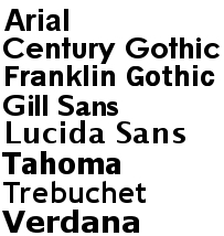
Commonly Used Font Combinations

The font-family property should hold several font names as a "fallback" system, to ensure maximum compatibility between browsers/operating systems. If the browser does not support the first font, it tries the next font.

Start with the font you want, and end with a generic family, to let the browser pick a similar font in the generic family, if no other fonts are available:
http://www.blogger.com/img/blank.gif
Serif Fonts

font-family : Georgia, serif
font-family : "Palatino Linotype", "Book Antiqua", Palatino, serif
font-family : "Times New Roman", Times, serif

Sans-Serif Fonts

Monospace Fonts

http://blog.varadesigns.com/css-web-safe-font-combinations/

Sunday, March 11, 2012

CSS3 Media Queries

CSS provides an easy way to target browsers on different types of devices, or different uses. For example, the design you produce for a normal desktop browser may not be suitable for a handheld device, or a printer. These are known as media types. There are several media types, and most browsers will generally concentrate on just one or two, depending on what they are designed to be used for. Opera is by far the most versatile, and supports six different media types.

CSS2 allows you to specify stylesheet for specific media type such as screen or print. Now CSS3 makes it even more efficient by adding media queries. You can add expressions to media type to check for certain conditions and apply different stylesheets. For example, you can have one stylesheet for large displays and a different stylesheet specifically for mobile devices. It is quite powerful because it allows you to tailor to different resolutions and devices without changing the content. Continue on this post to read the tutorial and see some websites that make good use of media queries.

Read More for Examples:
http://blog.varadesigns.com/css3-media-queries/

Friday, March 9, 2012

How to use CSS3 Orientation Media Queries

For a long time we have been able to specify styles for different media types using CSS, print and screen being the most recognizable. With CSS3 these media types have been extended to allow additional expressions, aka media queries, which gives us greater control on when specific styles should be applied. In this article I will focus on the orientation media query and have a fun demonstration showing how to use it.


Read More At :
http://blog.varadesigns.com/how-to-use-css3-orientation-media-queries/

Wednesday, March 7, 2012

CSS3 Create Multiple Columns

It is possible to create multiple columns for laying out text With CSS3 - like in newspapers! with single html tags

Below are multiple column properties:

» column-count
» column-gap
» column-rule

Browser Support

Internet Explorer does not yet support the multiple columns properties.
Firefox requires the prefix -moz-.
Chrome and Safari require the prefix -webkit-.

1. column-count :
The column-count property specifies the number of columns an element should be divided into:

div
{
-moz-column-count:4; /* Firefox */
-webkit-column-count:4; /* Safari and Chrome */
column-count:4;
}

2. column-gap :
The property specifies the gap between the columns:

div
{
-moz-column-gap:30px; /* Firefox */
-webkit-column-gap:30px; /* Safari and Chrome */
column-gap:30px;
}

3. column-rule : http://www.blogger.com/img/blank.gif
The property sets the width, style, and color of the rule between columns.

div
{
-moz-column-rule:3px outset #ff00ff; /* Firefox */
-webkit-column-rule:3px outset #ff00ff; /* Safari and Chrome */
column-rule:3px outset #ff00ff;
}

Read More At :http://blog.varadesigns.com/css3-create-multiple-columns/